Objectives
- Improve overall site architecture and navigation to enable easier browsing and a more frictionless experience
- Create a more user-friendly and more visual product story with improved navigation and filtering
- Build out a robust product locator functionality for both Canadian and US product catalogues
- Dramatically improve SEO performance and content marketing opportunities
- Implement a fully responsive solution backed by WordPress CMS
We feel very lucky to have found Net as they truly are an amazing team. From day one they understood our business model and have worked tirelessly to provide us with a first class website and continue to surprise us with some seriously clever and original PR and Marketing.
Karen Fielding
Classic Showjumps
PHASE 1
Branding
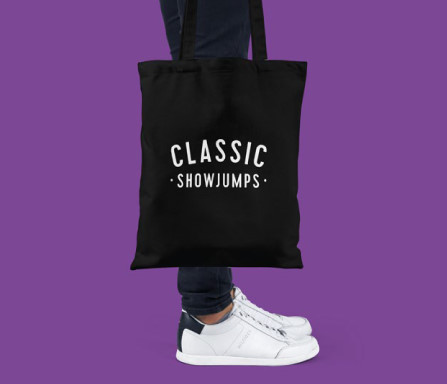
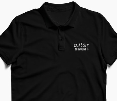
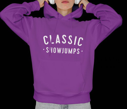
The visual brand identity for Classic Showjumps was a refresh of an existing brand. We wanted to refresh their appearance without completely losing any recognition they had previously built. A simple classic font was most appropriate and it lends itself well to the environments in which the brand appears. It was important that the logo was simple enough o drink down to work on all products and remain recognisable even when moulded into the plastic of their products. The colour palette had always involved purple and we added a classic black and white to create a brand as bold as their products.
Stefan Ritson
Creative Director

PHASE 2
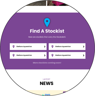
Website Design
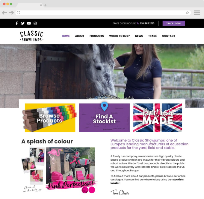
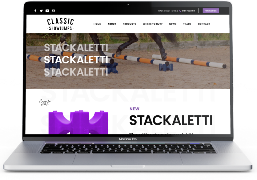
Classic Showjumps has a wide variety of products and utilities a bright colour palette. We designed the website to be mostly in a dominant monochromatic colour scheme so the products really stood out in contrast. We included additional imagery of the products and included a picture in every colour it was available in to help the customer visualise their purchase. We used videos and diagrams to showcase the specifications of the products so the website because a one stop shop for information about the brand and its products. We added a trade login that would show the trade price to those shopping B2B to customise the experience depending on the user.
Annette Ritson
Managing Director

PHASE 3
Packaging
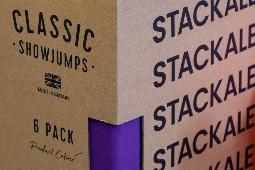
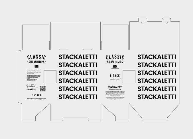
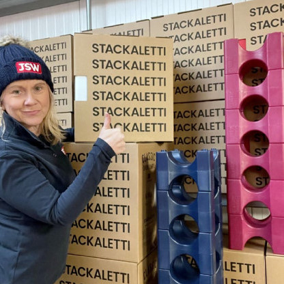
The brief was to design packaging for a new product that used minimal colours to keep costs down while also appearing bold and eye catching to compliment the new brand identity for Classic Showjumps. The use of the name of the product on the side was sucked to echo the way the product inside was used. The box also told the brand story and had interactive elements to add value to the product.
Stefan Ritson
Creative Director

Results
“Rebranding Classic was an exciting challenge that allowed us to really flex our creative muscles, and with our own in-house equestrians – design and develop a website truly centered to the user experience. Working with Classic is such a hands-on opportunity, from designing key elements for their latest product launches, to getting up close with the horses and photographing them in action. There’s never a dull day working with Karen and the team to develop their brand and help them jump the next obstacle. ”
PHASE 4
Social Media
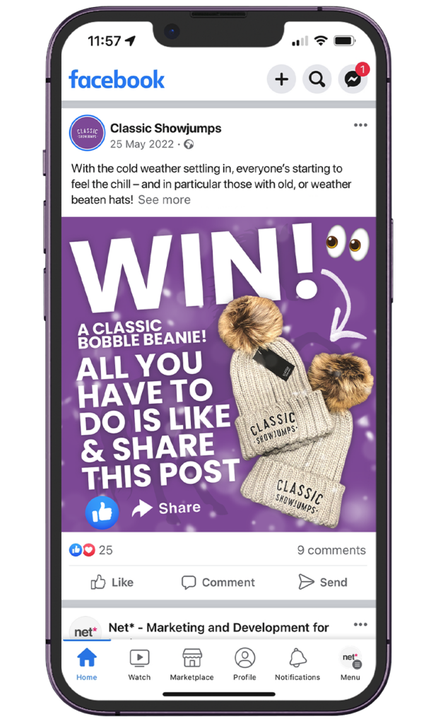
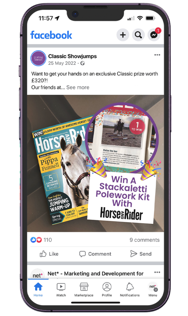
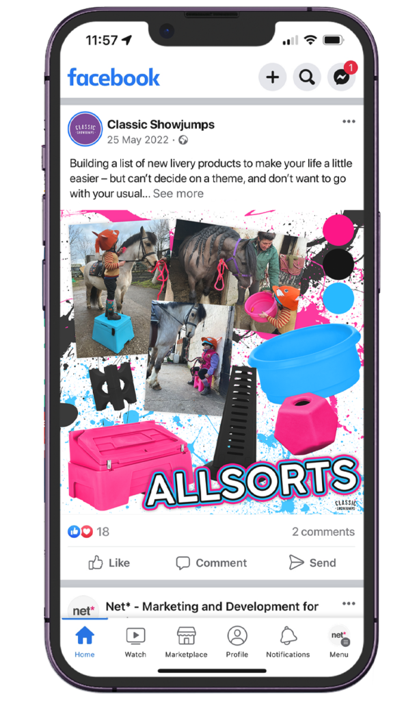
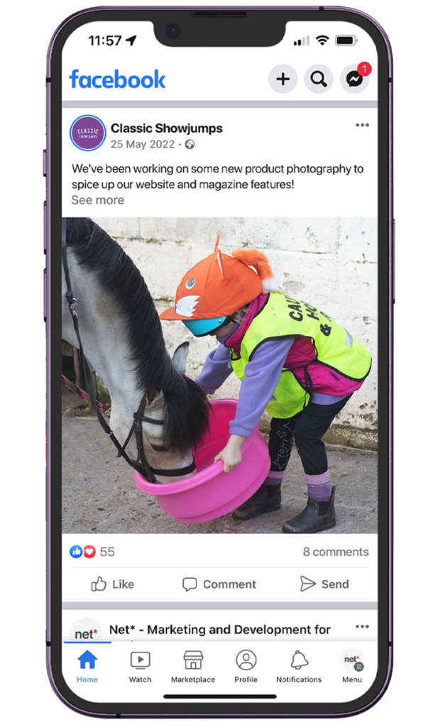
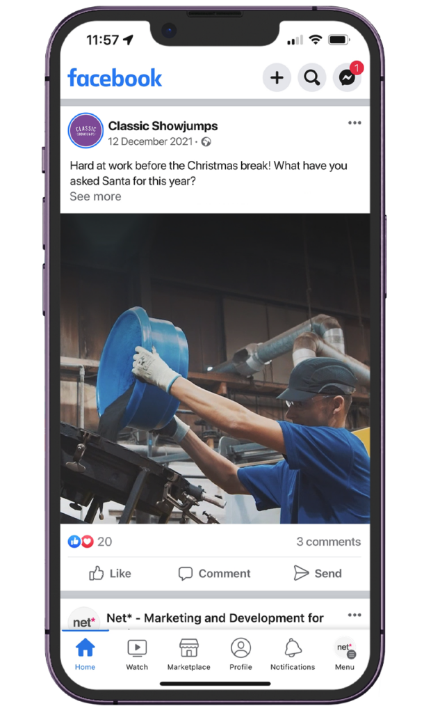
After drawing up a series of goals for the long and short term, our first task was to ‘re-establish’ Classic on social media and set out a framework for posting consistently. Built around a series of content pillars; product launches, press releases etc we’ve also utilized paid advertising to reach further than before, marketing their products to a countless number of potential customers and clients online.
Liam Bland
Digital Marketing Manager